Fuel Advertising office, Toronto
Double the creative juices followed when an advertising agency wanted a new office designed by Bartlett & Associates, which was able to harness the ad agency’s enthusiasm to deliver a mutually happy ending
Details
Project: Fuel Advertising office, Toronto
Client: Fuel Advertising
Design: Bartlett & Associates
Size: 1,900 sq m
Completion Time: Six months
Project Description
Working with creative clients can be a mixed blessing for architects and designers, On the one hand, you want someone who will share in your creative vision; on the other, creative people can have very clear ideas about what they want – and what they don’t want. It’s a situation Inger Bartlett of Toronto-based architecture practice Bartlett & Associates, which specialises in design schemes for advertising agencies, knows well.
‘With ad agencies, all the ad people are creative, so you don’t want to hurt anybody’s feelings. You have to be very diplomatic.’ she says. ‘Everybody feels that they’re creative and therefore must mean they can do creative spaces. What we sometimes have to bring to people’s attention is that they are creative in their own sphere, whether that’s digital or print or whatever, and that sometimes doesn’t translate into three-dimensional space.’
According to Bartlett, such issues were easily ironed out when it came to designing an office in Toronto for Fuel Advertising. ‘The client was fabulous,’ says Bartlett. ‘And I think we brought them back into line when they were veering off. That’s how it happens with creative people, because they get so enthusiastic about everything.’
The brief was to transform a warehouse building in downtown Toronto into a unique, creative space – all on a very tight budget.
Bartlett & Associates won a competition for the project largely on the strength of a previous scheme for advertising agency Saatchi and Saatchi. ‘The budget on that project was tight, too’, says Bartlett, ‘But [the client was] really impressed, and there was a feeling that, if we could do that for Saatchi, then we could do it for them, too.’
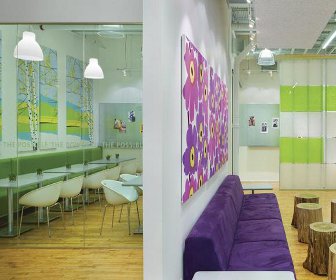
Bartlett and her team went for an industrial look, leaving the ceiling works exposed and using materials such as corrugated steel and plexiglass, softened with rich colours and graphics. ‘We looked at the industrial nature of the space and said, “We’ll work with this, rather than against it,”’ says Bartlett.
The designers named the aesthetic ‘power, punch and pop’, and created a bold, powerful look for the reception with a bespoke desk made of MDF, painted white, and coated with galvanised metal. Two strips of corrugated steel run along the length of the ceiling, and one wall has been painted red and emblazoned with the company’s motto ‘The Power of Possible’.
According to the designers, the ‘punch’ came from the use of vivid colours, which contrast with the raw, industrial materials, white walls and polished timber floors. Colour has been used to demarcate each area, for example, the cafe and creative space have touches of lime green, while the client services area has a purple, custom-made banquette.
To divide the various areas, Bartlett & Associates created screens from coloured plexiglass fixed with steel studs. ‘We limited our architectural vocabulary to things that were very reasonably priced, and we designed around those items. These really make the space. The plexiglass panels are meant to be bright, but with the sun coming in they really sparkle,’ says Bartlett.
The budget meant that there were very few opportunities to design furniture. ‘What we did on this project was modify furniture, more than design it from scratch,’ says Bartlett. While much of the furniture was ‘off-the-peg’, a couple of pieces were specially made pieces to give the office a designer look, such as the tree-stump tables in the lounge.
None of the furniture from the old office could be reused. ‘It was abysmal, and we said right off that they had to get some new stuff and they had to make it bright and airy,’ recalls Bartlett. Basic but effective workstations from Quebec company Artopex were chosen on price, though the aluminium legs and screens fit perfectly with the industrial materials used elsewhere.
‘Pop’ came from Seventies’ Marimekko fabric panels on the walls of the lounge and adjacent cafe. Oversized images of flowers and trees were chosen to chime with the colour schemes of the lounge – vivid purple, white and green – and the creative space.
Not surprisingly the agency is keen on slogans: aphorisms by luminaries as diverse as Michelangelo, Kurt Vonnegut and Steve Jobs adorn the walls.
This, says Bartlett, was an example of the aforementioned diplomacy. ‘Because the client is used to producing print campaigns they said they wanted to do it their way. ‘They didn’t use a lot of different fonts, but what we did suggest was that they put them on canvasses that are the same colours as the walls, so that the text really shows up,’ she says.
Main Suppliers:
Blinds:
• Solarfective Products - www.solarfective.com
Custom and specialty millwork:
• MCM - www.mcm2001.ca
Feature walls:
• Keilhaue - www.keilhauer.com• Cape Contract Furniture – - www.capefurniture.net
• Artopex – - www.artopex.com
• Perez – - www.perezfurniture.com
• Comfy Bean Bag Chairs – www.comfybeanbagchairs.com
Lighting:
• Eureka - www.eurekalighting.com • Artemide - www.artemide.ca
This article was first published in FX Magazine.