Google, Buckingham Palace Road, London
Designers get aboard the London-Brighton line with the colourful and playful interiors for this new London Google office, while still supporting serious work
Details
Client: Google
Design: Scott Brownrigg Interior Design
Size: 4,000 sq m
Completion time: 16 weeks
Project Details
Google, the company behind the world’s most popular internet search engine, has achieved that rare and privileged status of having its name become a verb (a good thing, then, that the company changed its name from BackRub early on). Nowadays most of us ‘google’ every day, and the company’s logo, with its distinctive font by German typographer Gustav Jaeger and brightly coloured letters, is now as familiar to many of us as our own front door.
With success like this comes rapid expansion, and when Google recently took on a new office for 300 of its employees (known as Googlers) near London’s Victoria Station, it needed Scott Brownrigg Interior Design to come up with a suitably vibrant scheme in just four months.
‘Google ran out of space in its existing London office,’ explains Ken Giannini, a design director at Scott Brownrigg Interior Design. ‘The company was growing quickly and needed to get people working in the new building as soon as possible.’
Scott Brownrigg Interior Design went up against two other practices for the job and, after winning, teamed up with contractor Cameron Black. ‘Because of the short timescale Google wanted to make sure we teamed up with the right contractor very early in the process,’ says Giannini. ‘If it had just been off-the-shelf furniture and standard partitioning it wouldn’t have been such a big deal for the contractor, but there were a lot of bespoke joinery items, which had to be manufactured off-site.’
You might think that Google, a company with designer offices around the world, would have some set ideas about the way its workplaces should look, but Giannini says the brief was actually very open. ‘Google has a document outlining its workplace guidelines, which explains how individuals and teams work and the type of support systems they need in their offices,’ he says, ‘but it doesn’t really go into the look and feel of the office.’
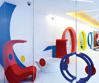
Even so, every Google office has its own theme relative to where it is in the world: ‘London’ was already taken by the company’s Belgrave House office, so Google decided on a London-Brighton theme, a reference to the office’s proximity to Victoria station and its historic rail link to Brighton. Scott Brownrigg Interior Design interpreted this in a number of ways, including using wall graphics of Brighton Pier and designing small meeting rooms to look like beach huts.
As you might expect, the Google logo features prominently, dominating the white wall at the back of the reception area. The letters are manifested in different ways: each ‘o’ is an elliptical doorway with sliding glass doors, which leads into a small meeting room; the letters on the wall are rendered in plastic laminate, and the tail of the second ‘g’ which extends across the white floor, is made of vinyl.
The reception desk is simply two standard 800mm x 1600mm tables placed behind a plasterboard wall which has been faced with painted glass. ‘Anything more elaborate would have distracted from the Google wall,’ says Giannini.
Various breakout spaces around the office are furnished with a range of loose furniture from Knoll, Hitch Mylius and Arper, and these areas, as well as the informal meeting rooms behind the reception, are popular workspaces.
‘The “Googlers” all have laptops, and they’ll often just sit down in one the breakout spaces and work there,’ says Giannini. However, ‘this style of working is optional, as there’s space for all 300 staff at Bene workstations arranged in clusters of six and eight.
Several insulated beach huts serve as private meeting rooms for up to three people and, as Giannini says, are often used to interview prospective new staff – ‘so the first impression for anyone who wants to come to work for Google is “Let’s go and have an interview in beach hut”,’ says Giannini.
Six videoconference booths made to look like dice – a reference to Brighton’s casinos – are simply made of sprayed MDF, and the numbers on the sides of each die are represented by cut-out holes covered with reflective laminate.
The design of the staff restaurant is a departure from the London-Brighton theme. ‘Here we took our inspiration from the food – pan-Asian cuisine and sushi – rather than the location,’ says Giannini. One wall has a large graphic of bamboo while benches and tables by James Burleigh echo the classic design of Japanese sushi and noodle bars.
A breakout area and library has custom-made stools made to look like liquorice allsorts sweets and versatile modular sofas made of high-density foam and wrapped in vinyl. ‘It’s basically like big play area for the staff,’ says Giannini.
Apart from working to a tight deadline, Giannini says the biggest challenge was balancing the fun, vibrant design scheme with an office that supports serious working.
‘If you stripped the look and feel of the scheme back to the basic components, the layout is actually that of a very logical and efficient workspace,’ he says. ‘So you can imagine if this was an accounting firm rather than Google, it wouldn’t actually be that different. Of course, then you wouldn’t have meeting rooms that look like beach huts!’
This article was first published in fx Magazine.