Opposites Attract
The minimalist interior of this Belgian villa was prompted by the owners’ desire to make a fresh start with a monochrome palette that focuses attention on the building’s lines and the play of light
For this striking new-build villa, Belgian interior architect Arjaan De Feyter used a monochrome palette and stark minimalism in response to his clients’ desire to make a fresh start. ‘The house reveals a lot about of the extreme character of the clients. They didn’t keep any furniture or decorations from their previous home because they wanted to start all over again — a radical approach that is reflected in the interior concept,’ explains De Feyter. By creating a blank canvas, De Feyter wanted to enable the space to evolve over time as the owners acquire more possessions. ‘There is room left for personal growth, which means any pieces they buy in the future will stand in contrast to the interior. The house will be truly finished in 10 or 20 years’ time,’ he says.
Architect Michel Muylaert had already created the internal structure when De Feyter began working on the house in Bonheiden, Belgium, so the interior designer worked to complement the open-plan space and vast floor-to-ceiling windows along the length of the living room, dining room and kitchen. ‘The interior focuses on light and has beautifully proportioned spaces,’ he says, ‘so the design combines an honest use of materials with minimum colour to maximize lines and perspective. All interventions are sized precisely and detailed accurately, creating quiet and intimate spaces despite the openness and sober colours.’ Natural light floods the entire space, with wide views to the garden providing a contrast to the design. ‘The garden brings colour into the interior,’ explains De Feyter, adding that black window frames throughout the house emphasise this.
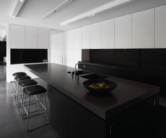
In the main living space, a dark grey floor of polished concrete stretches throughout, punctuated by black and white furnishings such as the rug and the Barcelona chairs from Knoll. An internal wall, which cleverly incorporates a working fireplace (custom made in collaboration with Bosmans Haarden) helps to create a sense of cosiness in a more intimate zone of the large living area. This wall is also used to store the firewood, which adds an unusual touch of natural colour to the scheme. ‘This feature is a surprising hot key in this symphony of white and black,’ says De Feyter.
A bespoke dining table in stained oak carries the dramatic colour palette through the dining area to the kitchen, where every detail is tailored to create an absolutely minimalist finish. ‘The lounge, dining area and kitchen form a coherent whole by sharing the same materials, colours and lighting. The dining space was like a part of the kitchen and colour was strictly banned, even from the photo by Marc Lagrange,’ says De Feyter. From the handle-less white lacquer and blackstained oak cabinetry hiding all appliances, to the inset sinks in the grey stone-composite counter, edges and lines are kept clean and rigid. The kitchen and dining room also open out on to a large terrace with a swimming pool.
At the front of the house, the dramatic entrance has a huge glass panel at its centre, which stretches to almost the full height of the building and incorporates the glass front door. Apart from this feature, the front of the house is more enclosed than the back — necessarily so to provide privacy — so it was vital to the project that the overall feeling of light, open space is apparent as soon as anyone enters the house. To help achieve this effect, De Feyter installed a glass floor above the entrance hall, which creates the impression of a double-height ceiling in the hallway. Upstairs, this floor acts as a bridge between the master bedroom and the rest of the rooms, which De Feyter created as ‘a clear visual separation’.
Hidden behind a vast sliding door in the hallway is the tranquil master bedroom. The white floors, ceiling and walls provide the backdrop for the splashes of black on the minimal furniture and decorations. Another photo by Marc Lagrange is central to the room. It dominates the gallery-like space and is lit by discreet lighting hidden within the bed’s headboard. ‘This spacious suite is conceived as a complete shutdown,’ De Feyter explains. ‘The scheme and the indirect lighting evoke a relaxing atmosphere.’
In contrast, the ensuite bathroom exists within an entirely black pod-like structure within the bedroom, another bold use of visual separation between spaces. The shower room and WC are enclosed by grey acid-etched glass, which provides the necessary privacy while allowing natural light through, and the rest of the interior walls are covered in black mosaic tiles.
This article was first published in idfx Magazine.