Red Bull, Amsterdam
The design of new offices in a former shipbuilding factory for Red Bull, not known as a shrinking violet, has gone all out with references to extreme and urban sports and its interest in spinning discs...
Details
Client: Red Bull
Architecture/interior design: Sid Lee Architecture
Graphics: Sid Lee Amsterdam
Size: 900 sq m
Completion time: 18 months
Photography: Ewout Huibers
Project Details
To say that Red Bull, the Austrian company behind one of the world’s most popular energy drinks, is image conscious would be an understatement. As well being represented by conventional advertising, it also sponsors a range of sporting events and even has its own record label. Red Bull tends to go all-out on the design of its offices, too, often favouring a rough-edged urban aesthetic in keeping with its sponsorship of ‘urban’ sports such as skateboarding and BMX.
In 2009, Red Bull Amsterdam decided to move from a converted mansion on the outskirts of the city and it invited architects to submit proposals for a new, more spacious building that would better suit its carefully honed image. The winning pitch, by Montreal-based architecture practice Sid Lee Architecture and its co-firm, graphics and branding agency Sid Lee Amsterdam, involved the renovation of a former shipbuilding factory in the Noord district – once a busy working dock, which is now home to several media companies, including MTV.
Built early last century, the capacious building was never intended to house an office complex, but the architects were quick to spot its potential: apart from its size, the building’s greatest attributes are its three parallel glazed roof gables which provide abundant natural light. This arrangement also meant cellular offices could be placed around the outside of the space leaving plenty of room for open-plan work areas and breakout spaces in the centre.
The natural character of the space was also attractive, say the architects. ‘The essence of a place is important,’ says architect Jean Pelland. ‘When you try to build character into environments from scratch you often fail, but with Red Bull we didn’t try to make a regular office. Instead we wanted to work with the history of the area.’
In planning the space the architects used the building’s roof gables to define three ‘bays’: one houses social and breakout areas while the others contain more conventional workspaces.
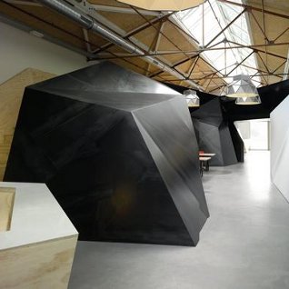
The first bay contains an architectural feature known as ‘the beast’, a steel skeleton structure covered with faceted panels of raw, gun-blue steel and plywood, which forms the walls and ceilings of several cave-like rooms, including a canteen named ‘the dive’ and a breakout area lit with neon lights called ‘the crash room’. There’s also a DJ booth, which is used for parties and company presentations.
‘The beast’ also creates a mezzanine level with built-in seating and houses lighting and air-conditioning units for the rooms below. According to Pelland, the steel panels represent the building’s shipbuilding past, while the plywood represents the DIY nature of urban sports. ‘The interior architecture, with its multiple layers of meaning, conveys this dual personality, reminding the user of mountain cliffs one moment and skateboard ramps the next,’ says Pelland.
Open-plan work areas occupy most of the other two bays, along with a meeting room clad in perforated steel called ‘the stratos’. After dark, the room’s internal lights shine through the holes, creating a dramatic effect. According to Pelland, this design feature, with its hundreds of tiny holes, was inspired by the image of craters left by meteors – a reference, he says, to the Red Bull Stratos, a death-defying stunt in which Austrian ‘extreme athlete’ Felix Baumgartner will freefall some 37,000m from a balloon in the stratosphere, on a date still to be announced.
Graphics produced by Sid Lee Architecture’s sister practice Sid Lee Amsterdam and drawn or painted directly on to walls, play a huge role in this scheme. One wall is entirely covered with graffiti, while many of the plywood panels are adorned with colourful doodles representing Red Bull’s interests. There are also stencilled designs including of Red Bull cans and the swirling grooves of a vinyl record. In the lavatories, a mosaic parodying an ancient Roman fresco depicts various scenes, including an angel spinning records on twin turntables and planes flying in formation.
According to Pelland these image represent Red Bull’s ‘holy shit’ list of extreme things Red Bull’s people would most like to do. ‘A lot of the activities Red Bull is involved in have graffiti associated with them so we really wanted to push that graphic element,’ says Pelland. ‘We also used it to balance the brutal elements of the raw steel and plywood and add colour and texture.’
Simple, modern furniture pieces, including Eames armchairs, were chosen to complement rather than upstage the interior architecture, says Pelland. But there are also some inventive bespoke pieces, including a real aeroplane wing which protrudes from one wall to function as a desk, while bespoke light shades rendered in faceted steel by Dutch designer Romy Kuhne complement the architecture of ‘the beast’.
Where this scheme really succeeds, according to Pelland, is in its versatility. ‘As architects we often try to determine everything about a space and prescribe the way it will be used. But here we just provided an outline and left the rest up to the people who work here. We’ve been surprised by some of the ways in which the client uses the space and for me that’s a powerful statement. It tells you that the client feels you’ve managed to imbed their identity in the space, that they feel at home, and are able to use it as they envisioned.’
This article was first published in fx Magazine.