Union Jacks
For the first branch of Jamie Oliver’s latest British-themed restaurant venture, cliché was out and nostalgia was in as the interior recreates a simple, homely world of cafe dining – with not a flag to be seen
Details
Client: Jamie + Bianco
Design: Blacksheep
Size: 400 sq m
Completion time: Nine months
Photography: Gareth Gardner
Project Details
Jamie Oliver seems rarely to pause for breath. Not satisfied with having opened one of the UK's most successful chain restaurants, Jamie's Italian, he's at it again. This time the celebrity chef, food campaigner and restaurateur has joined with American pizza aficionado Chris Bianco to open Union Jacks, a line of mid-priced eateries. The restaurants serve pizza-style flatbreads cooked in traditional wood-fired ovens, topped with quintessentially British - and locally sourced - ingredients.
As with Jamie's Italian, Oliver turned to London-based design agency Blacksheep for the interior of the first branch, located in the Renzo Piano-designed Central St Giles building in Holborn, central London (better known as the Lego building because of its brightly-coloured facades). The idea is that each restaurant will have its own design scheme, based on similar themes, and that Blacksheep will do some but not all of them.
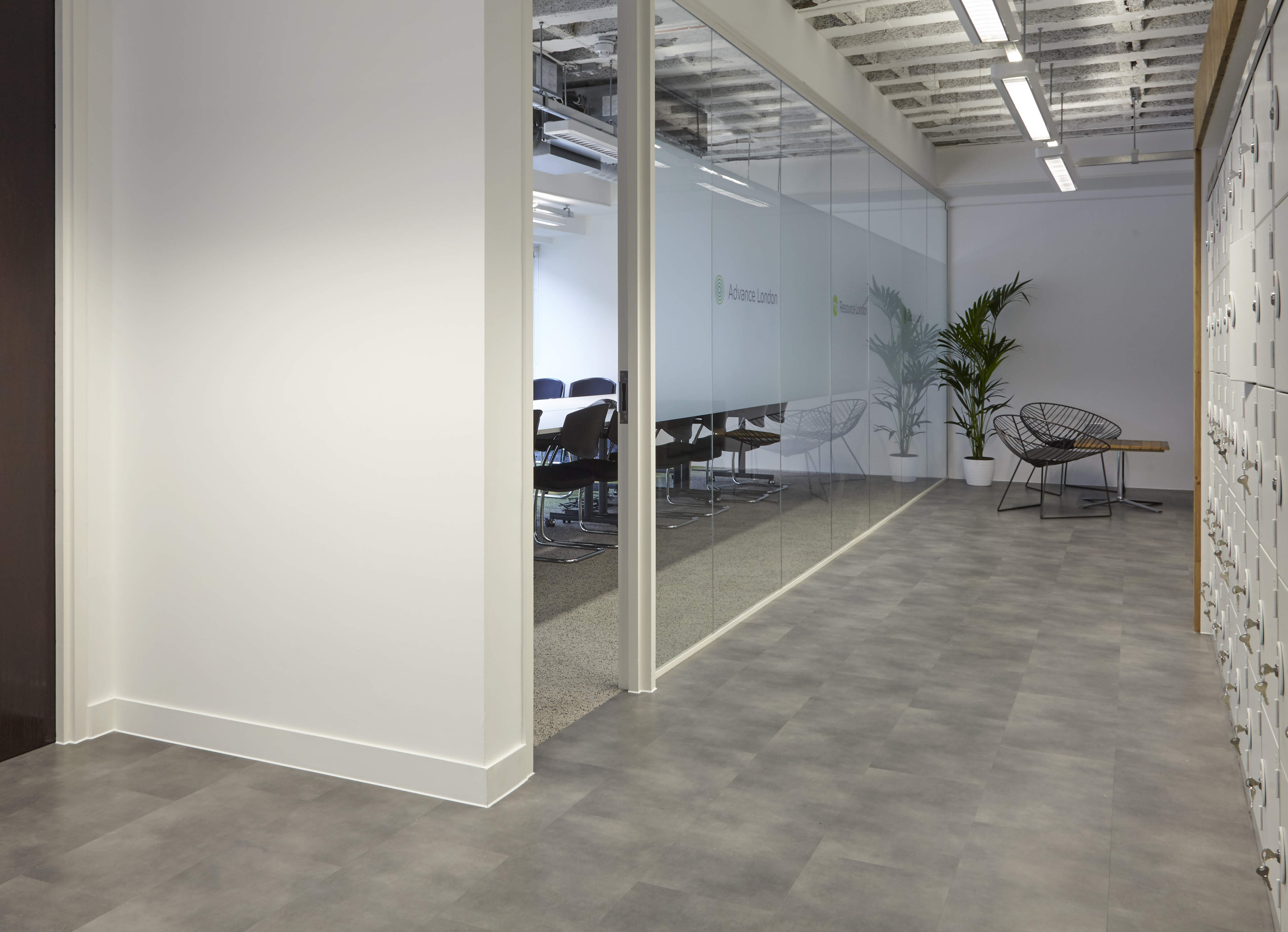
While the restaurant's central London location could hardly be better, the space inside Piano's building is awkwardly shaped: the main dining area surrounds a huge central column, which limits space. However, glass elevations give plenty of natural light. Blacksheep's designers have made the best of this space by arranging the restaurant's trademark wood-fired ovens and open kitchen/ food preparation area around the central column. They also created a second dining room in the building's basement to bump up the capacity to 150.
Once upon a time, Oliver was the cheeky, scooter-driving Naked Chef, but he now has so many strings to his bow - food campaigner, family man, successful restaurateur - that representing his style in a restaurant interior is no longer a simple matter. The trick, according to Blacksheep's creative director Jo Sampson, is to cut through the cliché and get to the real Jamie Oliver. 'When working with Jamie, as with all our clients, we try to capture "him", not a pastiche of his character,' says Sampson.
According to Blacksheep, '[Oliver's] love of British culture and heritage and his enthusiasm for encouraging the nation to eat better was a central theme for this project.' To this end, the area where the chefs prepare and cook the flatbreads - a work surface of polished concrete - is exposed so that customers can see the fresh ingredients used to create the dishes.
Having worked on previous restaurants for Oliver, including branches of Jamie's Italian, the designers at Blacksheep know the Jamie Oliver brand inside out, but creating another Jamie's Italian was never on the cards. 'It would have been very easy to make Union Jacks look like Jamie's Italian,' says designer Emma Freed, 'but we were clear from the start that we wanted Union Jacks to be something different.'
As the name suggests, the restaurant has a broadly British theme both in terms of food and design. But the designers have been careful to avoid cliché here, too: there's not a Union flag to be seen, for example. Instead, the scheme looks back nostalgically to the Seventies and Eighties, and even as far back as the Fifties. 'In terms of the finishes and the decoration, we tried to give a sort of classroom feel,' says Blacksheep associate Bill McGrath. The tables, for example, have a pattern inspired by graph paper, while the top of the central column is decorated with newspapers from the Seventies and Eighties. The bar has a perforated metal motif with a stencilled design taken from a piece of vintage wallpaper. There's also a nostalgic doff of the cap to post-war Britain in the form of plates inspired by the classic Beryl ware. With their distinctive pale green colouring, the plates look authentic, but if you turn them over you'll read the legend 'stop looking at my bottom', a reference to Oliver's cheeky Essex lad persona, perhaps.
Other nostalgia touches include an old cinema listings board above the food prep area, on which the menu is written in white plastic clip-on letters, and a quirky neon sign by graphic design agency The Plant, which is visible from the street through the glass facade.
Furniture and lighting is deliberately eclectic, and much of it, including vintage-inspired chairs and tables bearing a distinctive red stripe, is bespoke. 'We had a lot of the furniture made especially, because we couldn't find exactly what we wanted,' says Freed. As Blacksheep knew from previous projects, Oliver is not keen on bright lighting in his restaurants. At Union Jacks they decided to use a range of different light sources, from bespoke copper pendants made by Northern Lights to Anglepoise lamps on the work areas, each of which can be controlled manually to suit the light levels outside.
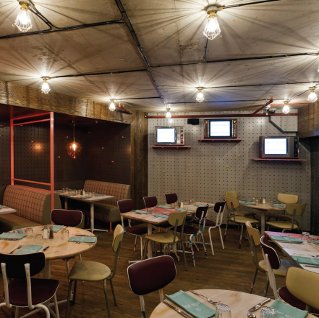
One of the greatest challenges on this project was making the downstairs space appealing. In contrast to the bright, sunny main room, the smaller dining area had no windows at all and diners seated here also miss out on the view of the open kitchen. To help matters, the designers installed vintage TVs on one wall which provide a video link to the preparation area upstairs. Leather-upholstered booth seating and glass pendants by Curiousa & Curiousa create a comfortable, intimate atmosphere, while one wall has a vintage wallpaper-inspired design hand-painted by Barnaby Purdy, a graphic designer and illustrator who has worked with Oliver before.
'I think the client was a bit dubious about this idea at first because there was no natural light,' says Emma Freed. 'To be honest we were a bit worried, too, but now it's open it's actually one of my favourite spaces.'
This article was first published in fx Magazine.